サインイン
はじめてのオートメーションをわずか数分で作成できます。Studio Web を試す →
Toucan Toco - RPA Data Stories
作成者: Toucan Toco
0
ツール
<100
要約
要約
Interactive data visualization application, for intuitively monitoring your RPA digital workforce
概要
概要
- Toucan Toco data visualization apps allow both real-time monitoring of your digital workforce and getting business insights out the data processed by the robots
- Toucan Toco offers a smooth, intuitive and user friendly interface. It assures an easy grasp of the data through navigation and storytelling-based experience
- Toucan Toco apps run flawlessly across any type of device (desktop, tablet, mobile, data wall, embed) which allows an easy and instant access to your data stories
- Toucan Toco offers both SaaS and OnPrem deployments
- Toucan Toco can be used both by business users who want to focus on a set of specific RPA processes in detail, and C-level managers who need an overview of digital workforce KPIs or a synthesis of the outcomes
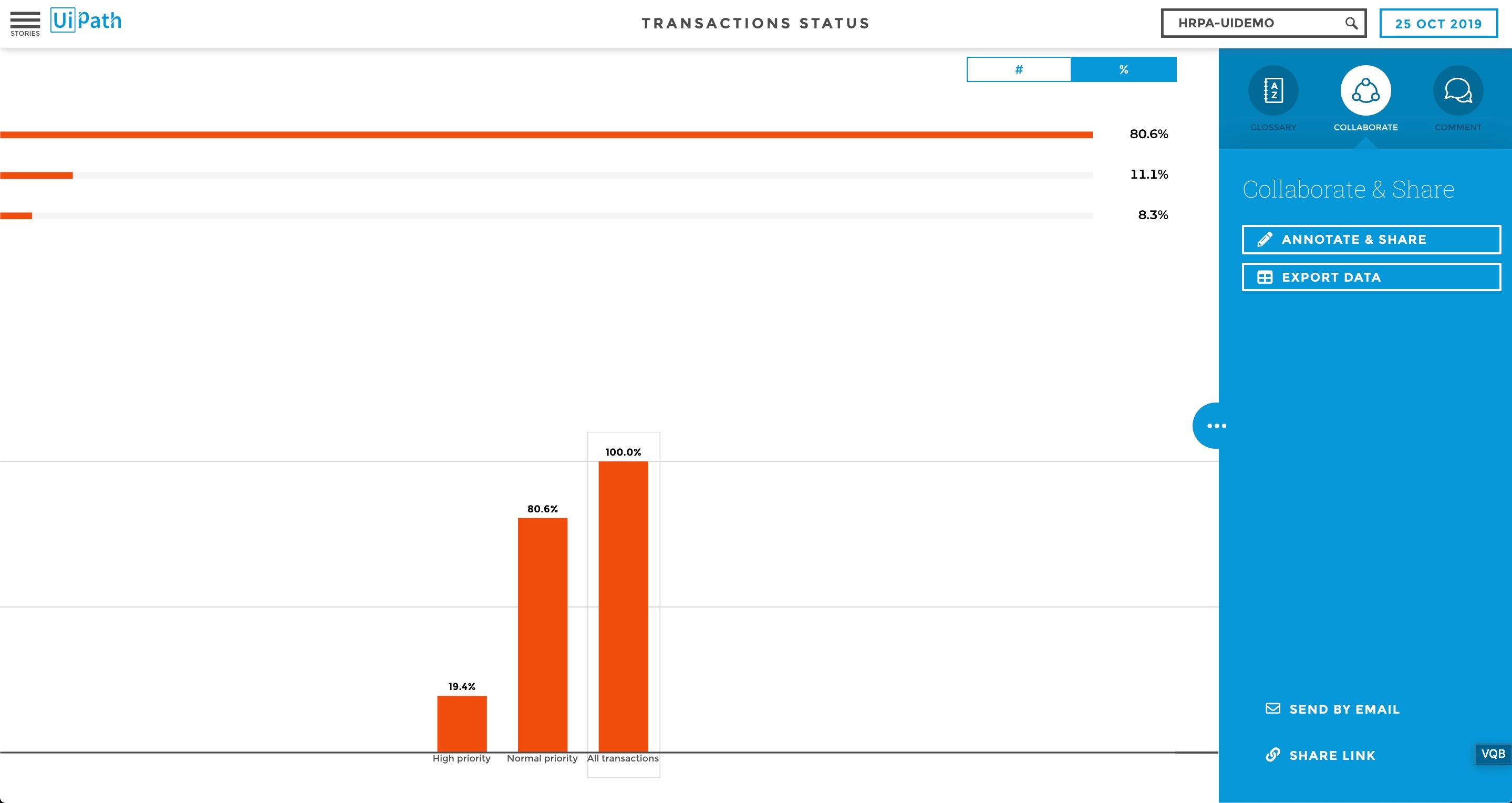
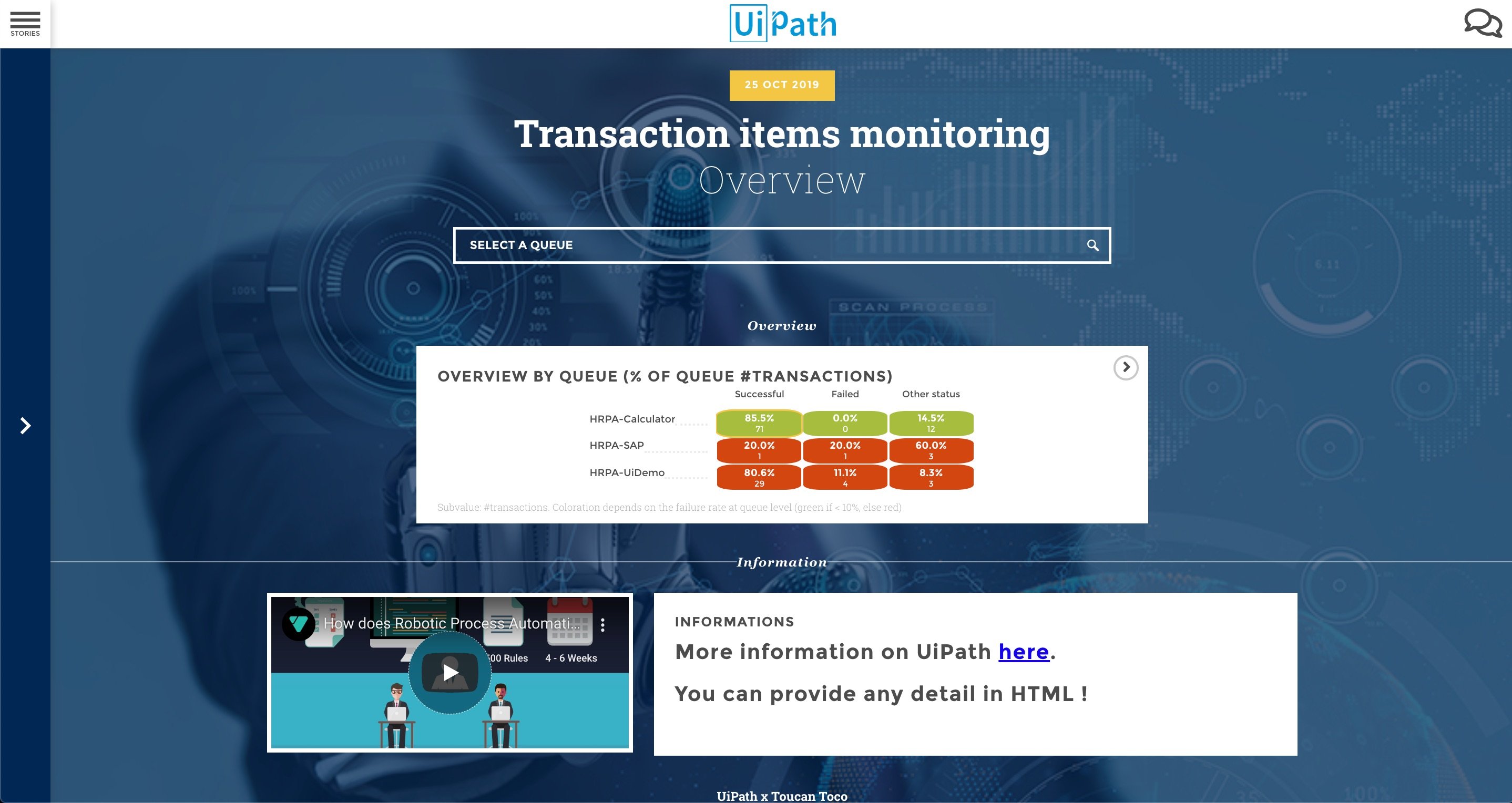
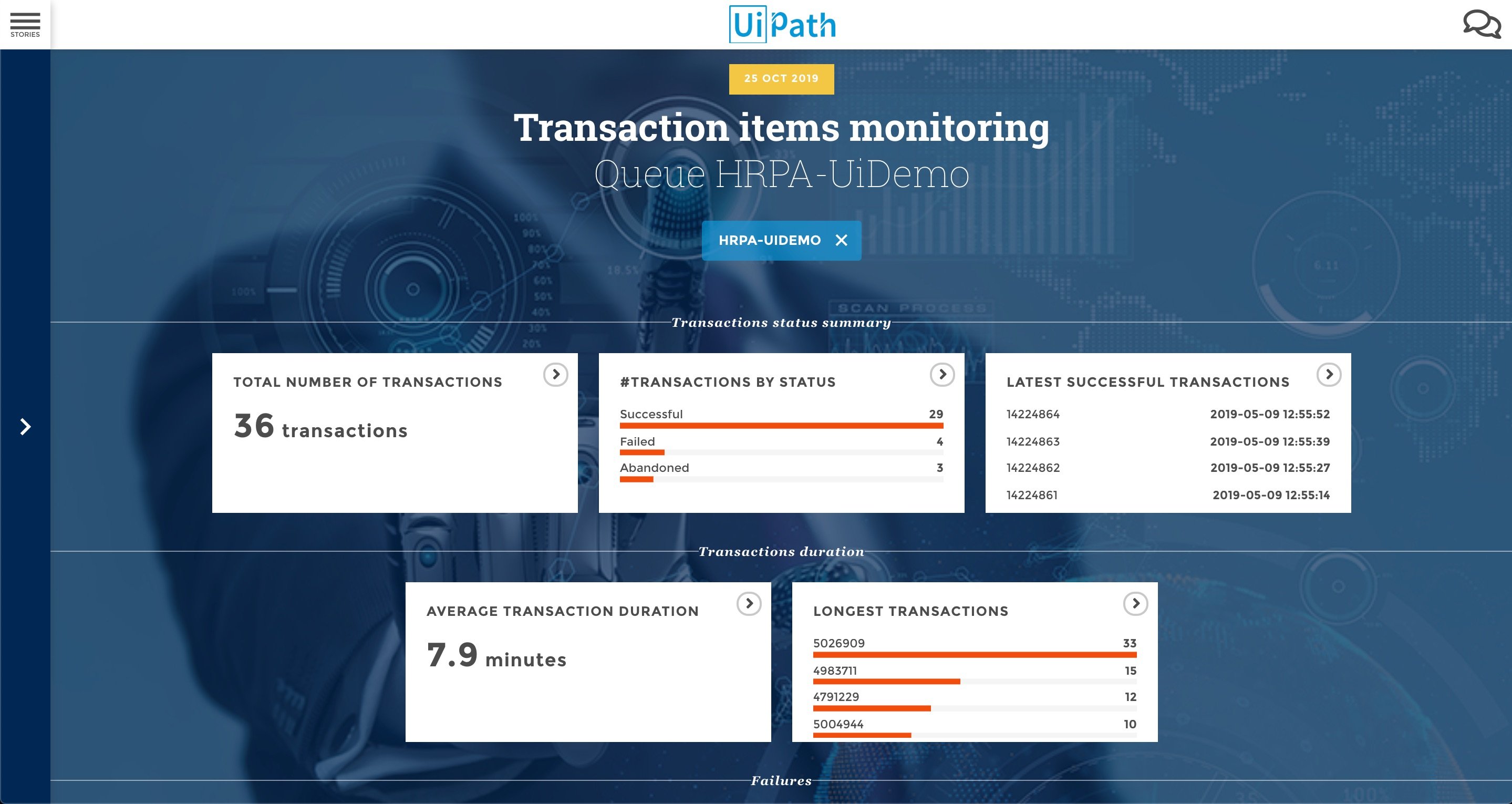
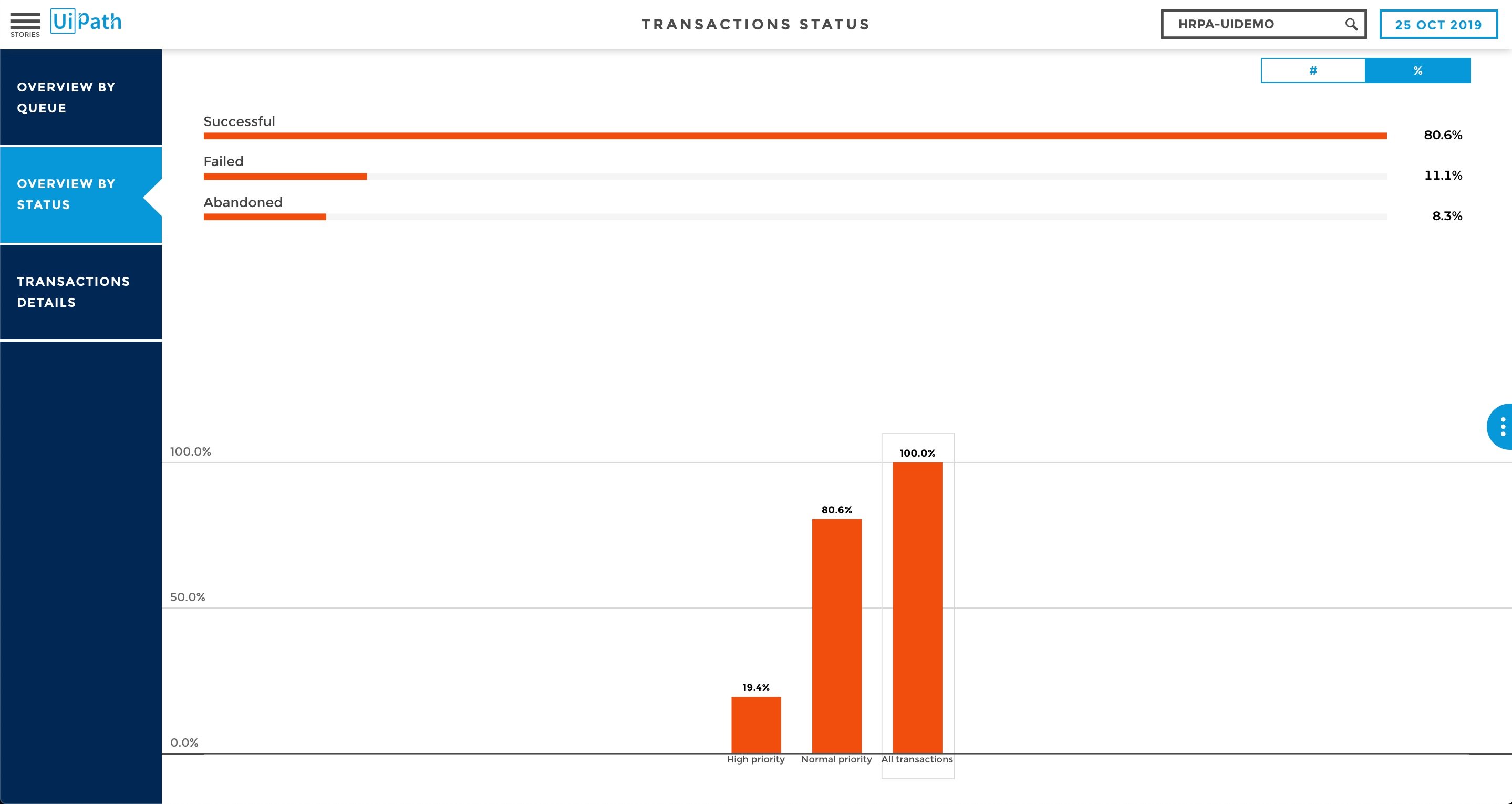
In this public demo, we showcase an application that reports the status of three Orchestrator Queues. You can navigate from a high-level overview to more detailed views about a specific queue.
機能
機能
Intuitive storytelling-based visualization of the digital workforce data Built once, deployed everywhere: responsive design that adapts to desktop, mobile, tablet, data wall, executive summary in PDF, embed on your website ! SaaS and OnPrem deployment Editorialize and contextualize information: comments, glossary, recommandations... Made for collaboration: Annotate & Share, Chat, Export, Presention Mode... Made for action: custom alerts, notifications, share... Ability to set-up custom alerts based on your data Ability to customize your users experience based on their profile: everyone gets access precisely to the content and data that he needs (and has the right to access)
その他の情報
その他の情報
依存関係
Access to your Orchestrator APIs


